In the early 1980s, computers were terrifying. They were brutal, hyper-masculine pieces of industrial equipment that sat on heavy steel desks, humming with a low, threatening electric current. When you turned on an IBM terminal, it did not greet you. It presented you with a stark, black screen and a blinking green cursor. The C-prompt. It sat there, pulsing, silently demanding that you speak its language. If you typed the wrong command, it spit out a cold, aggressive error message. "Syntax Error." It made ordinary people feel profoundly stupid. It made them feel powerless.
Steve Jobs knew this. He knew that the Macintosh project, which was already bleeding millions of dollars and running dangerously behind schedule, would completely fail if it only appealed to the ham-fisted hobbyists and electrical engineers who populated Silicon Valley. To build an empire, Apple needed to sell computing to secretaries, to artists, to teachers. They needed to sell the machine to people who were fundamentally terrified of it.
The engineers in Cupertino could optimize the code, and they could shrink the motherboard. But they could not write a line of code to fix human anxiety. To solve that, Apple did not hire another programmer.
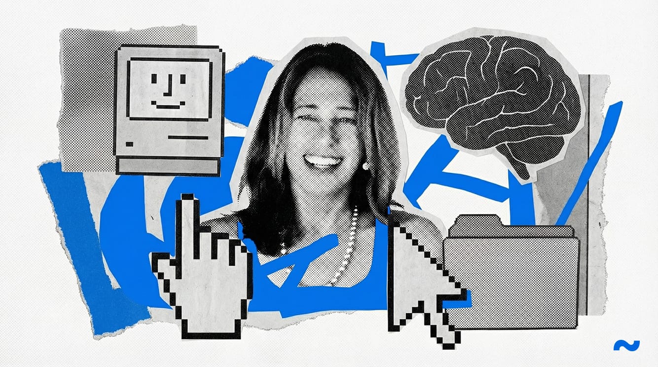
They hired a fine arts sculptor. They brought in a psychological assassin who used a grid of black-and-white squares to short-circuit human defensiveness. Her name was Susan Kare, and she engineered the most successful, manipulative Trojan horse in the history of industrial design.
The Sculptor in the Silicon Cage
When Andy Hertzfeld, a core software architect on the Macintosh team, reached out to his old high school friend in 1982, Susan Kare was not thinking about silicon chips. She was living in Palo Alto, working as an iron sculptor and painting. She possessed exactly zero experience with user interface design, mostly because the discipline barely existed outside the sterile, academic laboratories of Xerox PARC.
Hertzfeld didn't care. He knew the Macintosh needed a soul.
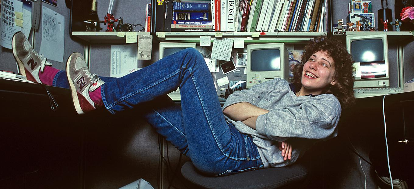
When Kare walked into the Apple offices, the physical environment was a chaotic, testosterone-drenched war zone. Empty pizza boxes stacked up against the walls. Engineers slept under desks. The air smelled of stale coffee, soldering iron flux, and the manic desperation of a team driven to the brink by Steve Jobs and his relentless, impossible demands. In the middle of this hyper-logical chaos, Kare sat down with a piece of graphed paper.
Because the Macintosh software was still being written, Kare couldn't design directly on the machine. Instead, Hertzfeld handed her a paper grid. Each square represented a single pixel on the future screen. She was given a brutally unforgiving canvas: thirty-two squares by thirty-two squares. She had two colors to work with: black and white. There was no grayscale. There was no anti-aliasing to smooth the edges.
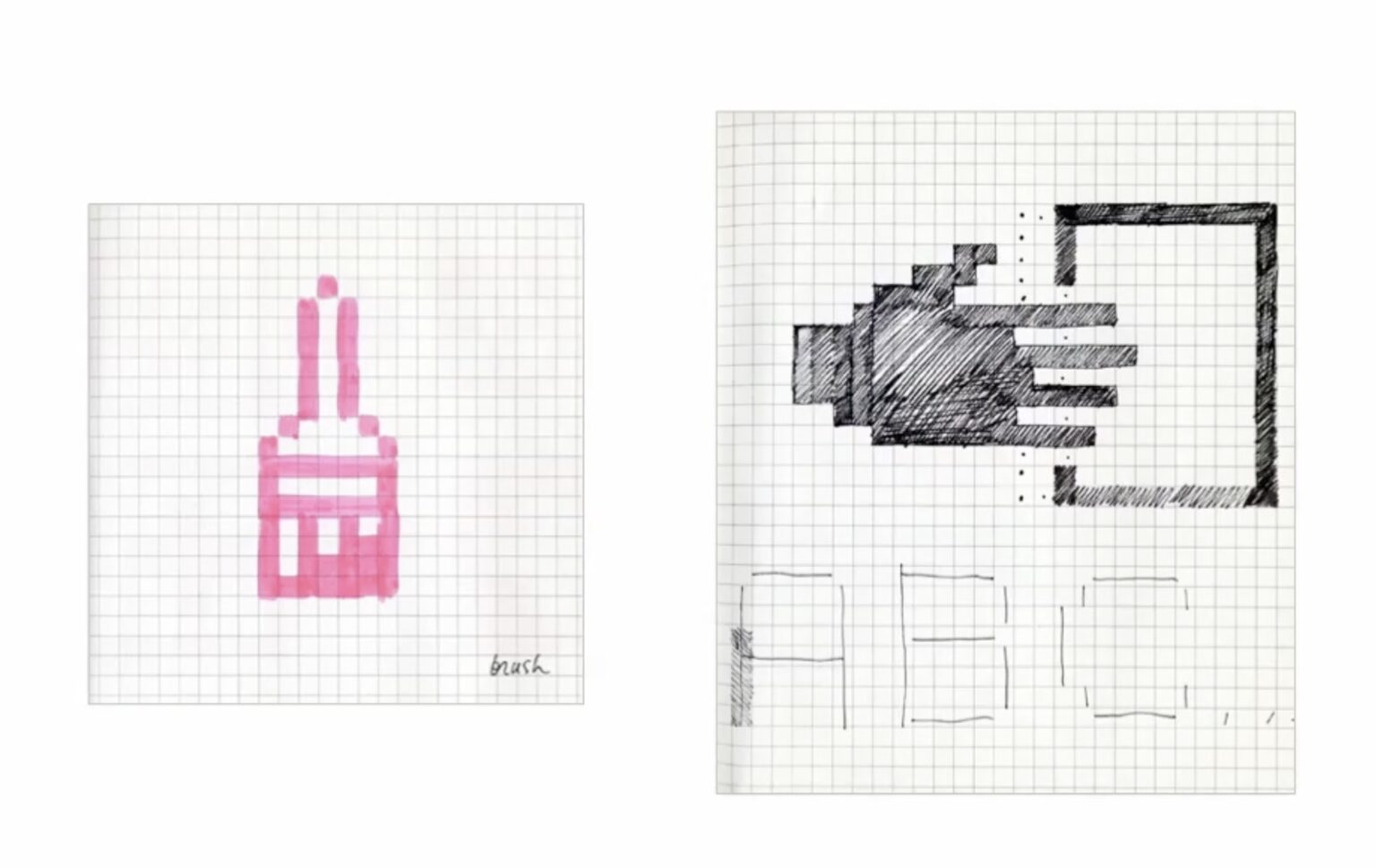
It was an exercise in absolute, ruthless economy. Every single square had to earn its existence. If she misplaced a single pixel, a paintbrush looked like a broom, and a piece of paper looked like a brick.
Kare began to color in the squares with a black marker. She wasn't just drawing pictures. She was translating the cold, terrifying actions of a central processing unit into a visual language that a human being could instantly recognize, process, and trust.
The Anatomy of a Digital Smile
The absolute masterpiece of Kare’s psychological warfare appeared the exact moment a user turned the Macintosh on.
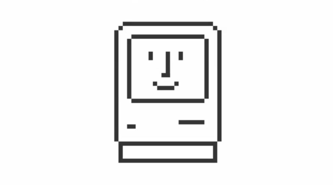
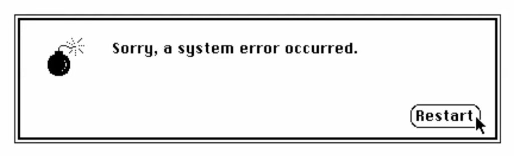
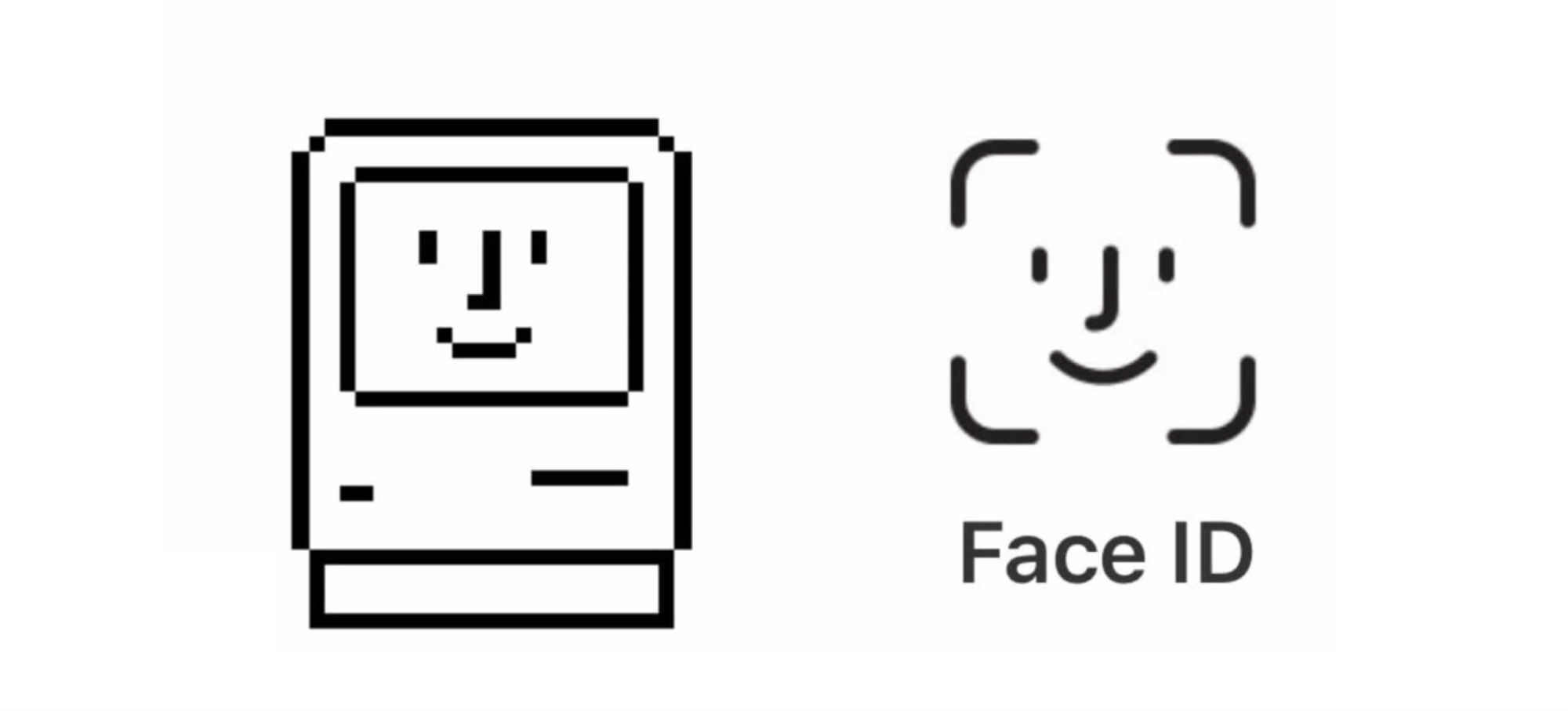
In every other computer on the market, the boot sequence was a stressful, anxiety-inducing wall of rolling diagnostic text. It was the machine talking to itself, completely ignoring the human in the room. Kare replaced that wall of text with a single, tiny image: the Happy Mac.
It was a small, blocky drawing of a computer with a gentle, curved smile and two eyes.
This was not merely a cute aesthetic choice; it was a devastatingly effective manipulation of human biology. Human beings are hardwired by millions of years of evolution to seek out faces. We look for eyes and mouths to assess threats. When a person turned on the Macintosh, the machine looked back at them and smiled. It instantly disarmed the user. It communicated a subtle, profound lie: I am not a machine. I am a friendly entity. I am happy to see you. If the computer crashed — a frequent occurrence in the early days of personal computing — Kare did not display a terrifying "Fatal Error" code. She drew a bomb with a lit fuse. It was a cartoonish, almost comical acknowledgment of failure. It took the emotional sting out of a software crash. Instead of feeling like they had broken an expensive piece of corporate equipment, the user felt like they had just experienced a minor hiccup in a comic book.
Kare was systematically softening the edges of the digital world. She took the terrifying concept of deleting a file — literally purging data from a magnetic disk — and turned it into an aluminum garbage can. She took the agonizing wait time of a processor loading software and turned it into a small, elegant wristwatch.
She grounded the abstract terror of the digital realm in the carnal, mundane reality of a physical office.
The Swedish Campground and the Egos of Men
To survive inside Apple in 1983, you didn't just need to be talented. You needed to know how to navigate the massive, fragile ego of Steve Jobs.
Jobs was notorious for his explosive tantrums. He would wander through the cubicles, stare at a designer's screen, and declare the work absolute garbage. He obsessed over the minutiae, demanding that the internal circuitry of the computer — parts the user would never, ever see — be laid out in aesthetically pleasing straight lines.
Late in the development cycle, Jobs looked at the Macintosh software menus and erupted. The engineers had mapped the main shortcut key to the Apple logo. Because there were so many shortcuts, the screen was suddenly littered with dozens of tiny, pixelated apples.
Jobs hated it. He screamed that they were taking the corporate logo in vain. He demanded an immediate replacement.
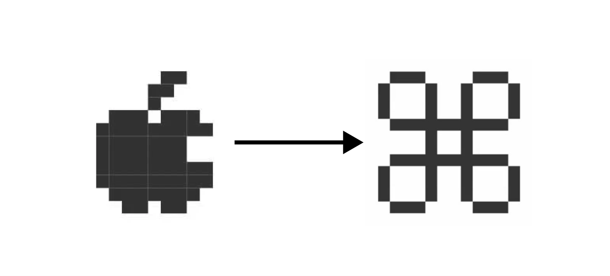
Most engineers would have panicked, scrambling to invent a new shape while the deadline loomed. Kare simply opened a comprehensive dictionary of international symbols. She calmly flipped through the pages, completely ignoring the corporate panic attack happening around her. She bypassed the standard mathematical symbols and the expected typography.
She stopped on an obscure, looping square. It was the Bowen knot. In Sweden, it was used on road signs to indicate a site of cultural interest or a campground. It was elegant, it was continuous, and it possessed a strange, ancient geometry that translated beautifully into a tiny grid of black pixels.
Kare digitized the knot and dropped it into the keyboard layout. Jobs looked at it, absorbed the strange, esoteric history of the shape, and approved it.
The Command key was born. It was a masterclass in managing executive hysteria. Kare understood that the men running the company wanted to feel like they were curating a museum of high art. By feeding Jobs a piece of obscure Scandinavian iconography, she bypassed his ego and permanently cemented a piece of actual art onto the keyboards of billions of machines.
The Legacy of the Trojan Horse
When the Macintosh launched in 1984, the marketing campaigns focused on the hardware, the mouse, and the revolutionary vision of Apple. But the people who actually bought the machine didn't fall in love with the plastic casing or the microprocessor.
They fell in love with Susan Kare’s pixels.
She had done the impossible. She had taken a cold, unfeeling box of silicon and glass and given it a personality. She taught the machine how to blink, how to smile, and how to communicate without intimidation. She single-handedly created the visual vocabulary of the modern digital age. The magnifying glass for searching. The floppy disk for saving. The paint bucket for filling color.
But as we look back at the origins of user interface design, we must also recognize the darker implication of the Happy Mac.
Susan Kare’s brilliant, empathetic design was the psychological Trojan horse that allowed computers into our homes, our bedrooms, and eventually, our pockets. By wrapping a fundamentally alien technology in the comforting iconography of the everyday world, she lowered our defenses. She taught us to trust the screen.
Today, that trust is routinely weaponized. The friendly interfaces designed in Cupertino and Mountain View are used to harvest our data, hijack our attention spans, and manipulate our dopamine receptors. The technology industry learned the lesson of the Macintosh perfectly: if you want a human being to surrender to a machine, you don't use a blinking green cursor. You just make the machine smile. ~
Sources
- Dernbach, C. Susan Kare – Designing the GUI of the Apple Macintosh (and much more). Mac-history.net, 2022.
- Esslinger, H. Keep It Simple: The Early Design Years of Apple. Stuttgart: Arnoldsche Art Publishers, 2014.
- Isaacson, W. Steve Jobs. New York: Simon & Schuster, 2011.
- Segall, K. Insanely Simple: The Obsession That Drives Apple's Success. New York: Portfolio / Penguin, 2012.
- Lashinsky, A. Inside Apple: How America's Most Admired—and Secretive—Company Really Works. New York: Business Plus / Grand Central Publishing, 2012.