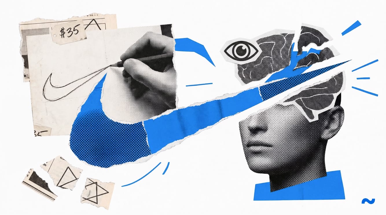
To understand why a single, unbalanced curve managed to fracture the global apparel industry, you have to examine the concrete prison of early-seventies corporate aesthetics. The visual language of American business was essentially brutalist architecture shrunk down to fit on a piece of letterhead.
Corporations wanted to project the immovable, granite stability of federal reserve banks, forcing their logos into heavy, perfectly balanced, symmetrically locked formations. In the sporting goods sector, Adidas deployed three rigid, parallel stripes that anchored the foot to the pavement like a structural cage. Their primary Japanese supplier, Onitsuka Tiger, utilized a chaotic lattice of intersecting lines that looked more like a mathematical grid than an expression of raw speed.
Everything was heavy. Everything was grounded.
The entire industry operated under the delusion that an athletic shoe was merely a utilitarian tool requiring a stamp of structural integrity. But staring at those heavy, symmetrical crests, the truth became painfully obvious. They were parked vehicles. They projected power, but they lacked the one element necessary for survival.
They lacked momentum.
A Desperate Deadline in Portland
The visual blade that would eventually slice the throat of the establishment did not emerge from the polished mahogany boardroom of a Madison Avenue advertising agency. It was forged in the damp, mold-scented environment of a Portland startup that was bleeding cash and rapidly running out of oxygen.
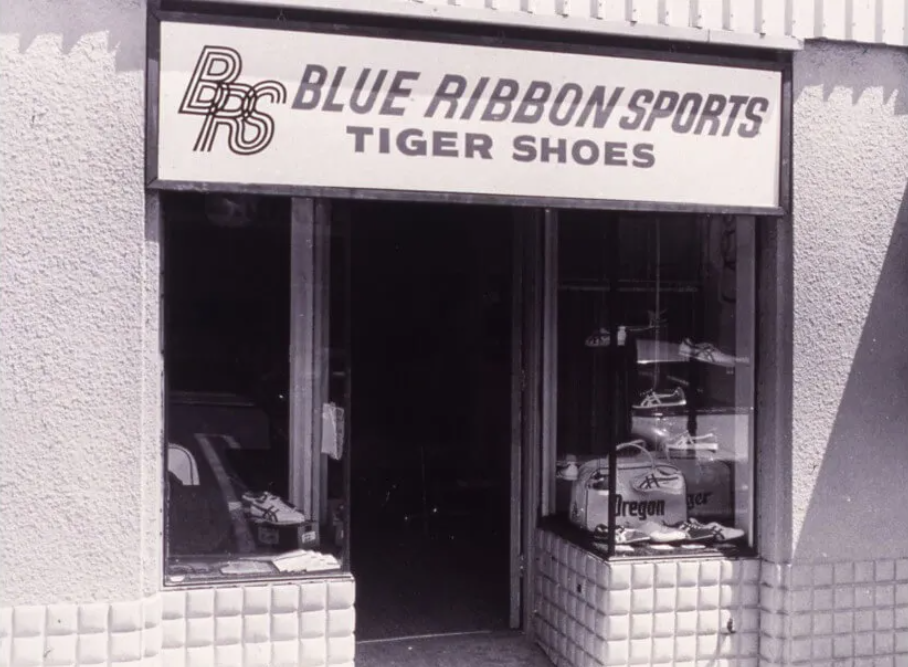
By the spring of 1971, Phil Knight was backed into a corner. His distribution company, Blue Ribbon Sports, was in the final, agonizing stages of a violent divorce from its overseas manufacturer. The panicked executive was launching an independent line of footwear out of pure survival instinct, executing a frantic pivot to escape the collapsing relationship before the banks called in his loans.
He desperately needed a brand identity to slap onto empty cardboard shoeboxes before the newly contracted Mexican manufacturing plants spun up their assembly lines. He did not have the capital for extensive market research, focus groups, or high-end artistic direction. He had an impending, fatal deadline — and a hallway acquaintance.
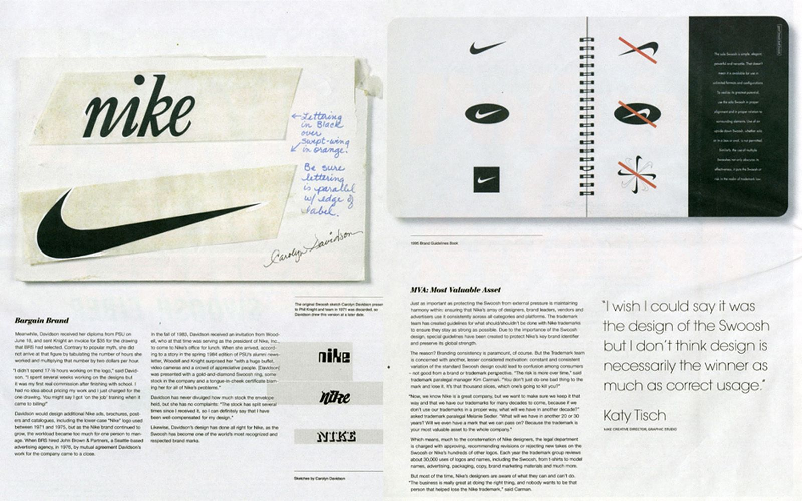
Carolyn Davidson was a graphic design student at Portland State University, quietly struggling to afford the heavy toll of oil painting supplies. The desperate founder had previously overheard her mentioning she could not afford to take a specific art class, prompting him to offer her a meager two dollars an hour to draft some mundane charts and graphs. Now, he needed a logo for this nameless, doomed shoe venture.
When I cross-referenced the timeline of the frantic launch with the initial, coffee-stained design invoices, the glossy corporate myth of instant visionary brilliance immediately collapsed into dust. The young designer was not tasked with capturing the transcendent spirit of a global athletic revolution. She was handed an impossible, hopelessly vague directive by a stressed executive whose company was circling the drain.
"Make it look like movement."
Engineering the Blade
Staring at the original 1971 tissue paper sketches housed in the archival records, tracing the graphite smudges left by her hands half a century ago, I realized the student was not just trying to please a volatile client. She was unwittingly engineering a psychological weapon.
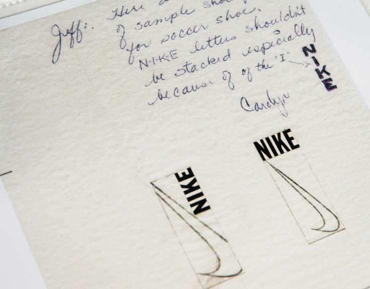
Most graphic designers of that era, when commanded to convey speed, would have retreated to the comfortable safety of literalism. They would have drawn a feathered wing, a blurred geometric shape, or a stylized lightning bolt. But the struggling artist bypassed the literal entirely and went straight for the neurological jugular.
She sat alone in her cramped studio, tracing over actual scale drawings of running shoes, aggressively crumpling up dozens of rejected paper sheets. She drew fat checkmarks. She drew bulbous boomerangs. None of it worked. The friction between literal representation and abstract concept was destroying the designs on the page. Finally, operating purely on frustration, she abandoned the traditional, rigid rules of corporate iconography entirely. She stopped trying to draw an object and started drawing an action.
She violently stripped away all the heavy, symmetrical weight that defined the competitors. She drew a thick, inverted curve that swooped downward before violently snapping back up and tapering off into a needle-sharp point. It was a fluid, unbroken, aggressive motion. It possessed absolutely zero straight lines.
More importantly, it possessed zero balance.
The Physics of Asymmetry
The human visual cortex is a ruthless, highly efficient pattern-recognition machine. It craves symmetry because symmetry signals order, equilibrium, and rest. When we look at a perfectly balanced shape, our brain immediately registers it as static, categorizes it, and shuts down the analytical process. It requires no further processing.
By weaponizing asymmetry, the designer forced the human brain into a state of continuous, unresolved visual tension. The swoosh possesses no center of gravity. It is heavier on the bottom left, curving upward and forward into absolute nothingness. The human eye physically cannot rest on it. The optic nerve is chemically compelled to follow the aggressive trajectory from the thick belly of the curve up through the razor-sharp tip. It perfectly mimics the raw, brutal physical mechanics of a runner’s foot striking the pavement, compressing under the weight of the body, and violently snapping off the toe.
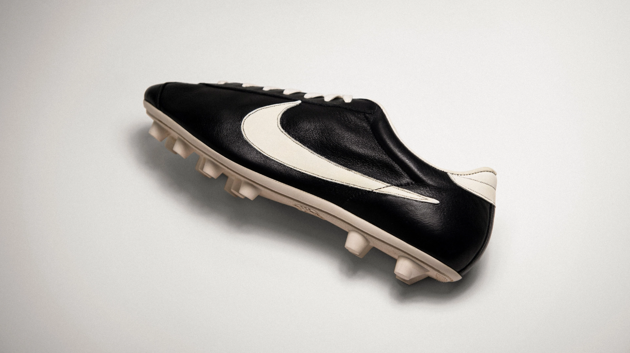
It was a calculated aesthetic hack. It forced the viewer to perceive forward kinetic energy even when the physical object was sitting completely dead still on a retail shelf. While the rigid, parallel stripes of Adidas locked the foot down in a prison of geometry, the asymmetrical curve of Nike looked like it was actively attempting to tear itself off the leather canvas.
The logo was moving faster than the shoe itself.
The underpaid student had bypassed the conscious, critical mind of the consumer and directly stimulated the deepest, subconscious perception of velocity. She had hacked the physics of human sight.
The Reluctant Surrender
The greatest, most bitter irony of this neurological hijack is that it was almost killed in the womb by the very men it would eventually enrich beyond comprehension.
When the young artist presented her final handful of designs in a cramped, poorly lit Portland meeting room, the atmosphere was suffocatingly tense. The factory in Mexico was actively demanding a physical mold to begin production. Time had entirely evaporated. The executive team stared at the asymmetrical blade resting on the table.
There was no sudden, cinematic hush in the room. There was no collective, lightning-bolt realization that they were looking at a psychological trigger that would define athletic dominance for the next half-century. The CEO stared at the bizarre, unbalanced curve and felt nothing but cold, hollow disappointment. It did not look like a prestigious corporate seal.
It looked like a mistake.
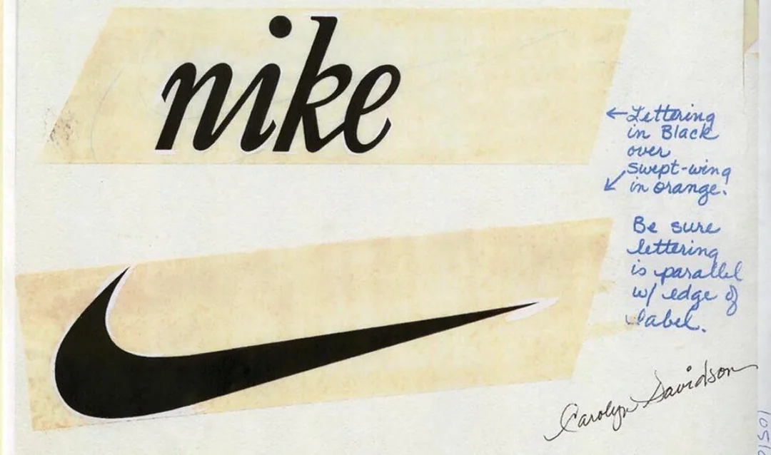
"I don't love it," he muttered to the exhausted room. "But I think it will grow on me."
It was a reluctant, begrudging compromise born of absolute, terrifying desperation. He chose the logo not because he possessed an innate, billionaire's radar for greatness, but because it was the least offensive option available at the final, expiring hour. He paid the broke student exactly thirty-five dollars, dismissed her back to her oil paints, and rushed the crude design off to the factory to be stamped onto cheap Mexican leather.
We are endlessly sold the glossy, sanitized fantasy that titans of industry possess a divine foresight, spotting perfection where ordinary mortals see only scribbles on tissue paper. We want to believe the empire was a calculated destiny, guided by infallible instincts and boardroom genius. But peeling back the fragile layers of the 1971 origin story reveals a reality far colder and infinitely more fascinating.
The most recognizable emblem of speed on the planet was a cheap, rushed hack of human visual psychology, purchased for the price of a tank of gas. The founder hated it. The designer just wanted to pay for her supplies. And yet, the blade cut through the noise anyway, tearing a permanent hole in the fabric of the industry. Sometimes the deadliest weapons are the ones you pick up entirely by accident, completely unaware of the razor edge hiding under your thumb. ~
BrandAnatomy operates independently. You can anonymously fund future forensic deep-dives.
Sources
- Knight, P. (2016). Shoe Dog: A Memoir by the Creator of Nike. Simon & Schuster.
- Strasser, J., & Becklund, L. (1991). Swoosh: The Unauthorized Story of Nike and the Men Who Played There. Harcourt Brace Jovanovich.